Booking redesign
UI / UX - project
Booking.com's UI has a reputation for being inadequate, so my colleagues and I took action through a UI project to address its shortcomings and improve user experience.
Team
5 MEMBERS
Time
2022 NOV - 2022 DEC
Role
UI-Designer, User-tester
Tools
Figma
Background
Booking.com, founded in Amsterdam in 1996 and now owned by Booking Holdings Inc., is a global leader in digital travel services. With operations in 43 countries and over 28 million bookable options, including accommodations, flights, car rentals, attractions, and airport taxis, Booking.com facilitates seamless digital communication for today's travelers. After a period of pandemic restrictions, the platform continues to offer users a convenient way to plan and book trips, reflecting a shift towards digital interactions preferred by modern consumers over traditional methods.
Purpose
The purpose of this project is to investigate whether it is possible to improve the website Booking.com so that its usability, according to theoretical concepts, provides an innovative and simple experience for users. To improve the website, a prototype will be developed that users perceive as easier, more enjoyable, and more intuitive for booking a trip to a destination.
Result
Process
Phase 1 - Initial research
Phase 2 - Process & analysis
Phase 3 - Concepts & Iteration
finding issues with booking
In our effort to improve Booking.com, we focused on key pages and discovered critical usability issues. The explore page suffers from cluttered design and complicated filter navigation. Likewise, on the hotel and room selection pages, the lack of clear organization hinders users from finding information efficiently.
Complex navigation
Cognitive load
Poor design
Explore page
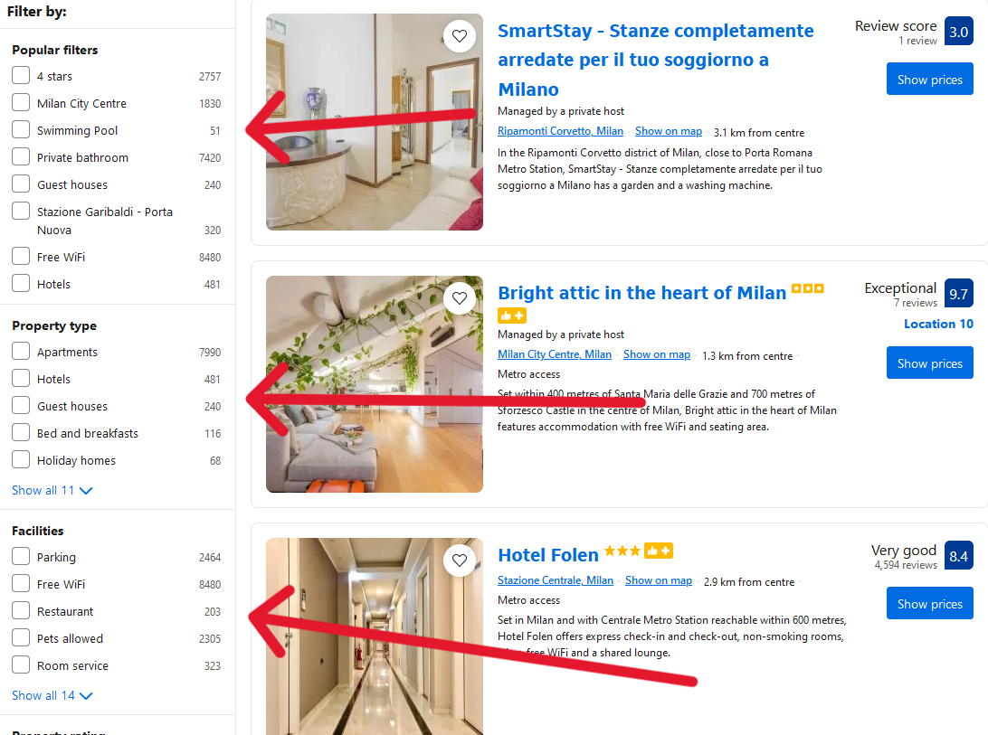
The explore page on Booking.com suffers from a cluttered user interface that overwhelms users with too much information at once. Navigating through numerous options for accommodations, flights, and activities can be confusing and lacks intuitive organization. The lack of clear filters or categorization makes it challenging for users to refine their search effectively, leading to a frustrating user experience.


Filters
The filter options on the explore page of Booking.com present a lengthy list that can be overwhelming for users. While they offer a wide range of search criteria, such as location, price range, and amenities, the sheer volume of options makes it difficult to find and apply specific filters efficiently. Users may struggle to navigate through the extensive list, hindering their ability to customize searches according to their preferences and needs.
Hotel page
On the hotel page after finding a hotel on Booking.com, the user interface can feel cluttered and overwhelming. While it provides extensive information about the property, including photos, amenities, and guest reviews, the layout lacks clear prioritization and organization. Users may find themselves scrolling through a dense array of details without intuitive grouping or hierarchy.


Chosing room
When selecting a room on Booking.com the page presents a variety of room options with varying prices, amenities, and cancellation policies. The absence of intuitive filters or sorting options further complicates the process of finding the ideal room.
User test - First round
In user test 1, the original website was evaluated for semantics, guessability, effectiveness, efficiency, and satisfaction. This was done by observing participants' actions, timing specific tasks, and recording errors. Participants were also asked questions about their experience navigating the site and completing tasks.

Task 1 - Chose a room for two
The user went to Booking.com to book a room for 2 adults in Amsterdam from January 3rd to 5th. They picked a place, chose a room, proceeded to checkout, and entered fake details. The test ended after that.
Task 2 - Milan hotel test
The user booked two rooms on Booking.com for 2 adults and 2 children in Milan from Friday to Sunday, with specific amenities and a 2000 per night budget. They checked out with fake details, ending the test.


Task 3 - The feedback survey
Participants answered questions about their booking experience, confidence, and feedback on what worked or didn’t. This focused on satisfaction, while earlier tasks covered effectiveness and efficiency.

Redesign
The redesign of Booking's website in Figma resulted in a minimalist interface with fewer features and less information compared to the current site. This was due to time constraints and the removal of unnecessary elements during development, such as advertising placements and specific offers.
Explore page

Orginal

Redesign
COMMENT We've streamlined the page to address user complaints about clutter by focusing on price, hotel stars, ratings, and images, allowing more side-by-side comparisons. The search menu remains for consistency, replacing the confusing yellow menu.
Filtering

Orginal

Redesign
COMMENT Filters are now fixed at the top with selected filters shown, reducing information overload.
Hotel page

Orginal

Redesign
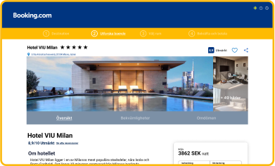
COMMENT On the hotel page, we highlight images and prices with a new scroll-following menu for easier booking. Information is now segmented into categories like overview, amenities, and reviews, reducing clutter. Room options appear later with a banner indicating the booking step.
Choosing room

Orginal

Redesign
COMMENT The room selection matrix is now a pop-up, providing clearer distinctions between rooms with images and relevant details. We moved the room quantity selection to the checkout, replacing the problematic drop-down, making it more intuitive and harder to miss.
Room info

Orginal

Redesign
COMMENT In the first user test, all users wanted to see the exact room they would get with their booking, but due to the color and design of the room link, low and medium-experience users couldn't access room-specific information. So, we created a new page with images instead of a list, showing the specific room's services and features.
user feedback on redesign
The semantic differential scale revealed that the redesign brought participants' perceptions closer to the desired expression across all aspects compared to the original website. The difference was particularly pronounced in areas like cluttered versus minimalist, which was a key focus during the redesign.
